There's a lot that can be done with data. It can be gathered, looked at, talked about, laughed at, questioned, etc. How it is looked at though can itself become an art form.
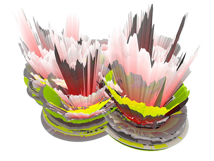
Depending on the data sets, there's a variety of ways that it can be represented. There's the most standard ways: bar graphs, pie charts, line graphs. Then there's some of the crazier ways that manage to combine different styles. Two of my favorite formats are flow-type data charts such as this and then there are 3D line graphs like this.
What makes these art though? To me its simply because it has a nice design to it. The colors and style of either option just seem much more engaging than a standard bar graph. Yes, that graph has color, but it isn't engaging at all.
There's not much to consider for some of the simpler data visualizations, but when the representation is creative and has some form of depth, that is when you can call it art.
Subscribe to:
Post Comments (Atom)

No comments:
Post a Comment